Process
I initiated the project with comprehensive market research, analyzing competitors and conducting surveys with potential users, using google forms and other studies. The research I gathered concluded that the users preferred AI functions in the fridge display to help them be more aware of eco-friendly consumption. Regarding Ekoland, they preferred a more recognizable feel to the shop since the main focus on changing their shopping habits would have the most impact on the Samsung display.
Based on this data I created a concept and project goal by brainstorming innovative ideas that align with user needs and project goals. Developed personas, scenarios and mapped out user flows for key app functionalities, to guide the design process.
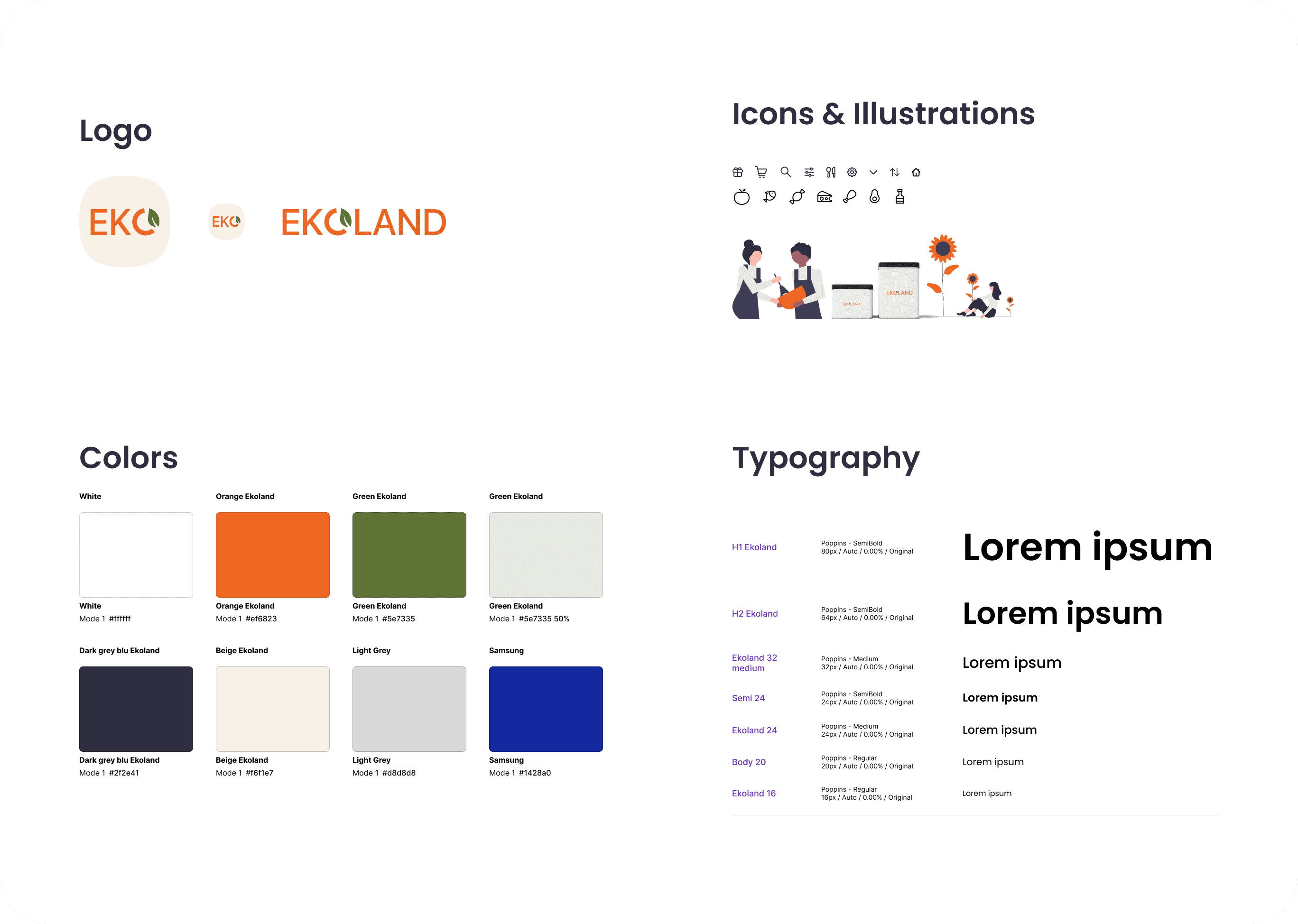
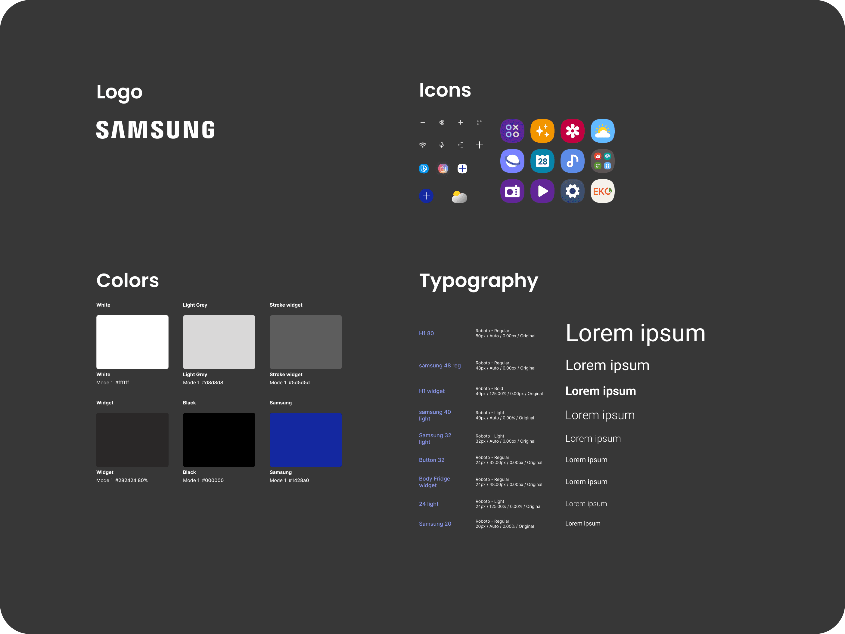
I created detailed wireframes and interactive prototypes using Figma. Selected a warm and inviting color scheme and typography that reflects the shop's eco-friendly focus, while using Samsung inspired colors and typography for the fridge interface.
Both in-person and remote testing of the prototype were made with potential users of the fridge display, to gather feedback on the usability and the design. I analyzed user feedback which concluded that the users preferred a familiar e-commerce design for Ekoland and a simple Samsung interface, with the most important functions on the home screen. Based on this input, I updated the design to address user concerns and enhance the overall user experience.
Outcome
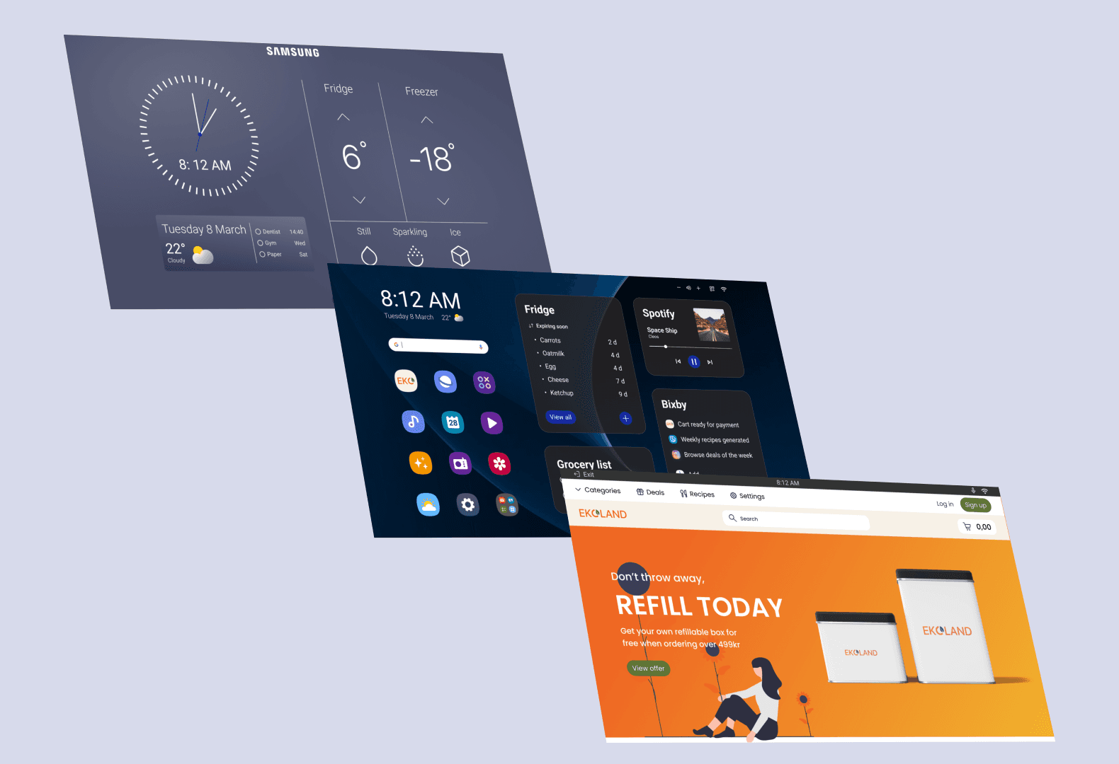
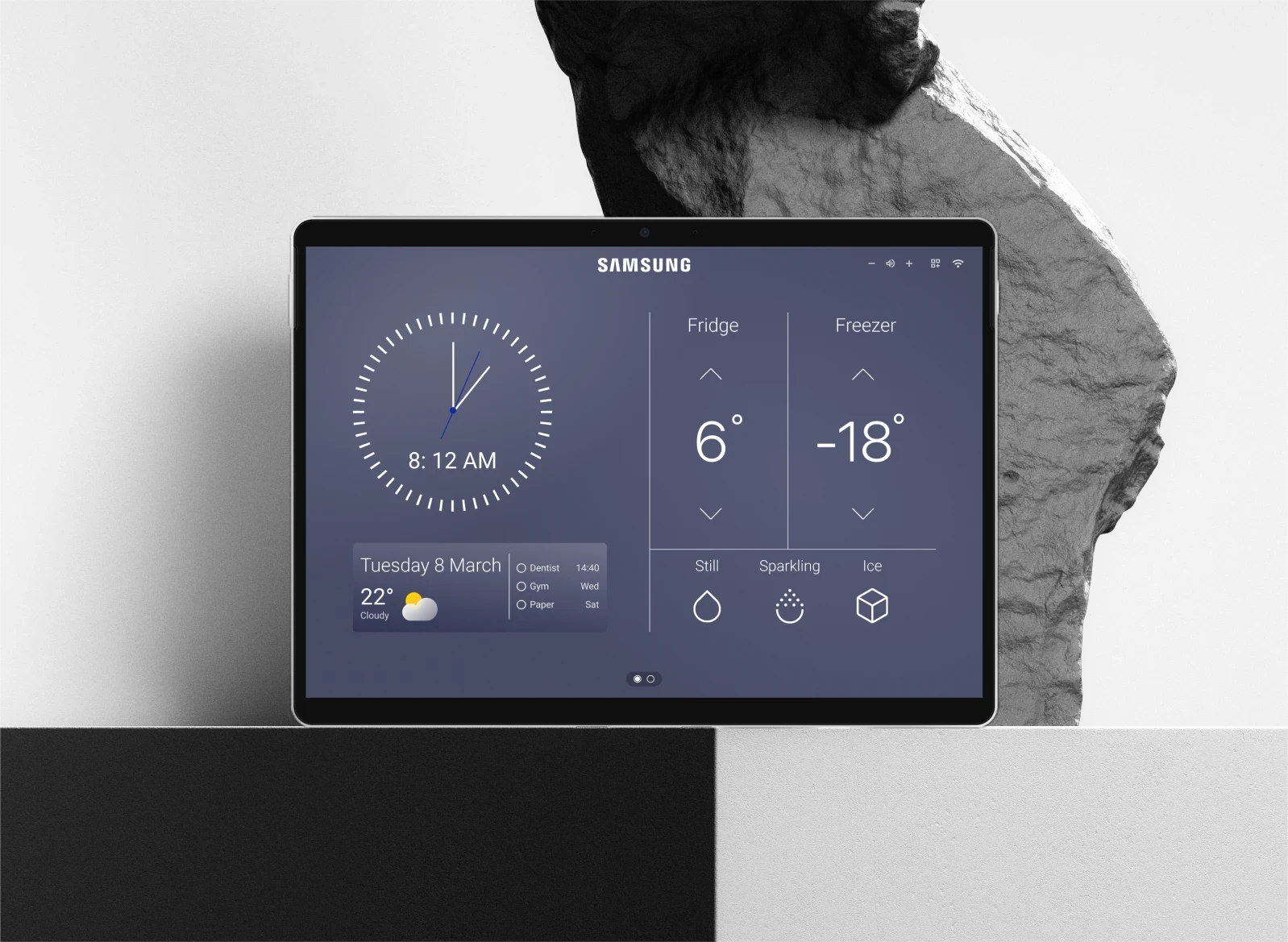
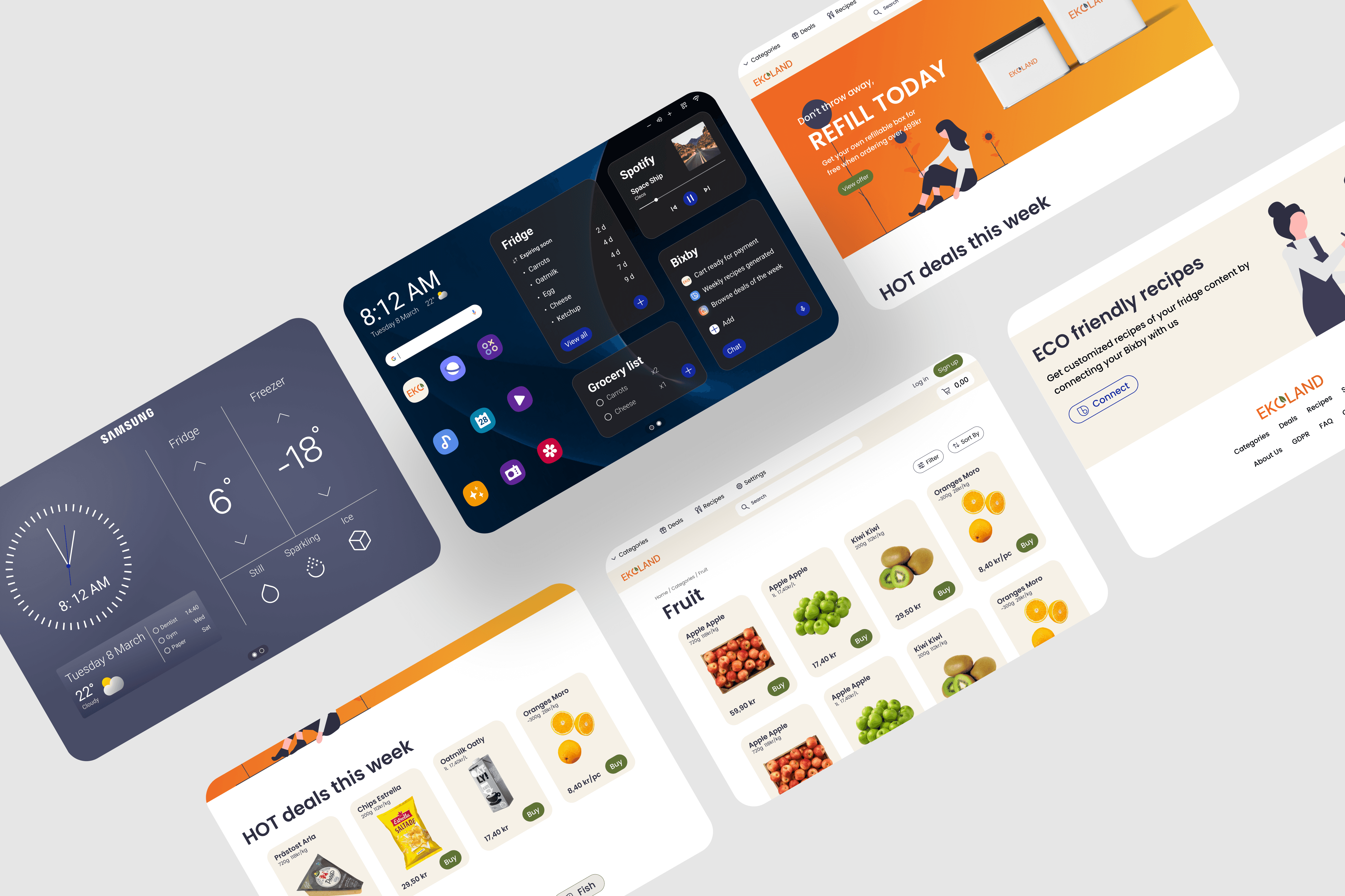
The Samsung display is minimalistic with, according to the user tests, the most important functions on the homepage. This includes the elements that are expected to be most useful in everyday life, such as time, date, timer, fridge & freezer temperature and personal calendar. These widgets are set as default but some of them, based on user wishes, are able to be changed. The other page of the display includes the most important AI functions to help the user to think more eco-friendly. It is functions such as reminding the user of which groceries are about to expire and help with creating weekly- or daily recipes.
Ekoland grocery shop has a familiar UI. It should be easy to navigate and avoids unnecessary clicks. It has big buttons and text since it is on a fridge display to simplify the use of the website.
This project was a testament to the importance of thorough user research and iterative design in creating solutions that truly meet user needs and make the user journey as easy and smooth as possible. It was also an opportunity to develop my skills in creating a design system, components, work with variables and structure in Figma.
